Code
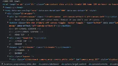
 Not a lot to see here as far as code goes. Basic HTML structure is about all I could see. I
don't know what this site is designed with, but there was little CSS to see. Because I wasn't
really able to dig into the code, I'm only giving this site a 3 heart review for the code.
User Interface - UI
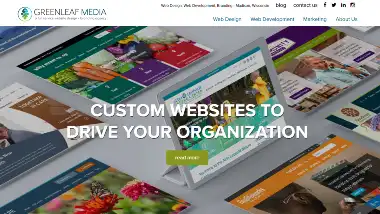
 The design of this site very simple. But it's clean and easy to navigate. The landing page is
interesting as it
scrolls around and zooms in to focus on what I presume are their designs. The navigation is
simple and straightforward, and contact information is readily available. I'm going to give it a
4 heart review for user interface.
User Experience - UX
 While this isn't a very fun or interesting site to visit, I think it serves it's purpose well.
It showcases the companies work, while enableing the user to learn about them, and contact them
for further investigation. Again this site wasn't really that interesting or engaging. So I'm
only giving it a 3 heart review for UX.
Summary
For my 2 cents worth I really like this site. It's a little busy for me in places, but the colors are fun, and the navigation is clear. It gives me a teenage girl vibe, so I hope that was what she was going for. The information that's provided on the site is clearly defined in the main nav at the top of the screen. And it's always clear that there's more to see if you scroll. The site is built on craft cms which I've never heard of so I'll be checking them out when I have a chance also.