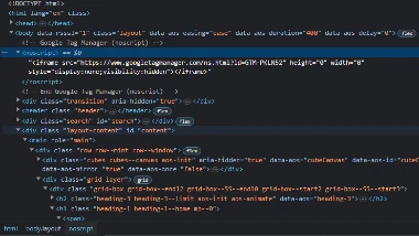
Code
 It didn't take long for me to find a tag that I didn't recognize. The
 noscript
tag was new to me, and I had to look it up.
User Interface - UI
 Upon landing on the site, I was left wondering what they were all about. I had to read to figure it
out!
There is a distracting amount of movement on the site to me. It left me playing with the elements
instead of reading their content. The navigation is good, and let's you know where you are on the
site well.
User Experience - UX
 The site left me feeling lost most of the time. When you land on a page there's a block of text, and
no indication that there is more to see.
It was mostly an act of desperation that made me scroll to see what else is there. The muted colors
combined with the lack of direction on the pages
left me feeling less than excited about their product. I also found myself staring at a green screen
for extended periods of time while the page loaded.
Once it took so long I thought my PC had frozen and I closed the browser.
Summary
In summary I didn't care for the aesthetics of the site at all. The lack of contrast of the muted green color with the white cubes made it hard for me to focus. The lack of direction left me feeling lost most of the time, and the hanging up of the transition page when navigating only added frustration to the mix which resulted in an unpleasant experience for me. There was a lot of interactive movement on the site, like the background that shifted with the mouse movement. That kept me distracted for longer than I'd care to admit. It did leave me wondering how the hover effects were achieved.