Extract UI Items
jekyllrb.com

User Interface Discussion
The menu is clean and clearly visible with the yellow color that draws your attention to it. I also like the stylized hover affect with the depth created with the recessed appearance.
This is a navigation element with an unorderd list element for content.
jekyllrb.com/news

User Interface Discussion
I really like the splashes of color on the dark background of this site. These little red banners draw your attention to the different areas of interest and also tell you what the area is about. The way they wrap adds depth to the page.
This is a span element with another span element nested inside for content.
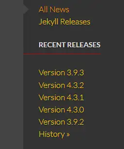
jekyllrb.com/news

User Interface Discussion
This simple little red line adds so much to the design. It seperates the nav menu into clear sections without adding clutter or blank space.
Basically this is just a one px border added to the bottom of the aside h4 tag. It butts up to the main section by having a -30px left margin applied.
jekyllrb.com/docs

User Interface Discussion
I think this is really effective to draw attention. And I like the way it appears to wrap around the back. It adds depth to the page.
This is a paragraph with two classes styling it p.note and .warning. there is a background color assigned and a background gradient. I've looked into the ::before and it appears that is used to insert an image before an element which I think causes the banner to wrap. This same technique is used in the second element that I showcased.